
How can employees live by values they don’t know, understand or see in action?
By Sally Pritchett
CEO
Clear and role modelled values have the power to shape workplace culture – but a growing disconnect is fuelling mistrust.
We can all agree that having clearly defined and communicated values, that are lived and respected by all and consistently used to drive decision making and guide direction, is the bedrock of a rich workplace culture. Sadly though, there’s a growing misalignment and it’s causing challenges from behaviour and performance to trust and even wellbeing.
So, what’s going wrong? Let’s take a closer look.
The communications gap
There remains a gap in clear articulation and communication of values to employees. According to Gallup, only 23% of employees feel informed about their company’s values. That’s backed up by Cezanne HR who report that 60% of employees don’t know or don’t feel aligned with their organisation’s values.
The culture misalignment
Even when employees do know the values, this can surface other challenges. According to HR Magazine just 18% of employees feel their organisation’s stated values are strongly aligned to the reality of its culture causing them to quickly lose faith in leadership and culture.
The leadership disconnect
The gap widens when it comes to executives and leadership, 85% of whom believe they “effectively communicate the company’s values” whilst according to Ge-Ipsos only 62% of entry level employee agree, adding to mistrust and disengagement.
The unequipped squeezed middle
And when it comes to trust, Line Manager behaviour is seen as the single most important driver of employee trust and yet only 26% of managers say they’ve had any values-based support or communication training.
The burnout risk
Employees need to see how values apply to their day-to-day work, yet Mercer report that one in every five who feel at risk of burnout attribute it to a misalignment between their own values and the values of their employer.
Internal comms leaders might be tired of creating endless values materials that have become wallpaper but not really shifted belief or behaviour, it’s clear that values remain at the heart of workplace culture.
Bringing your organisational values to life
So, what’ the answer? It’s not more posters that launch but don’t land or another top-down broadcast that doesn’t win hearts and minds. Instead, we work with our clients to create deeper storytelling, more inclusive co creation or that enable employees to feel seen and recognised and equip critical middle managers with the confidence to talk with their teams about values in everyday conversations.
Want to dig a bit deeper?
Take our Values Diagnostic – built for internal communicators who want to check what’s landing and where the gaps might be in their values comms. It only takes a couple of minutes and gives you tailored insight with practical next steps. Take the diagnostic.
We see the impact of clarity every day through our THRIVE methodology – our framework for helping organisations build fairer, healthier and happier workplaces through better communication. One of its six pillars is Values – focused entirely on how people connect and align their behaviour to your organisation’s values. If you’re struggling to make your values come to life, this is a good place to start. Read more about THRIVE.
Need to build engagement and alignment to your values?
Exceptional workplace cultures don’t happen by chance, they’re built through intentional, inclusive and inspiring communication.
We can help you:
- Simplify and articulate your existing values in a way that helps everyone understand the expectations on them
- Launch or re-launch your values in a way that brings fresh energy, engagement and alignment
- Keep your values alive through behaviour change, leadership alignment and consistent, embedded communication
There’s no one-size-fits-all when it comes to values comms. That’s why we offer three ways to work with us – depending on where you are now, and where you want to get to.
Activator – Have a story you need to tell? We help simplify complex ideas, shape strong narratives and build campaigns that bring everyone with you. Book a call to discuss your brief.
Pathfinder – Struggling for budget but need direction? Join our community of passionate changemakers and access free guides, tools and events. Sign up to join Work Wonders here.
Co-creator – Already have an in-house team or agency but need fresh thinking? Tap into our advisory services to bring in external perspective and energy. Let’s talk about your challenges, book a call here.

How can your employees support your strategy if they don’t know the destination?
By Sally Pritchett
CEO
Strategic clarity shapes business success – and communication can make or break it.
If employees aren’t clear on where the business is heading, how can they help get it there or contribute ideas to move it forward?
According to the 2024 IC Index, almost one in five employees were not clear on their organisation’s strategy or how their performance could contribute to it. That’s hardly surprising when, according Harvard Business School only 28% of execs and managers can list their organisation’s top three strategic priorities.
Have we got lost in jargon and over-complication to the point where we’ve lost the golden thread? Or is the world moving so fast that yesterday’s strategy is no longer relevant, and we’re all simply trying to keep up?
Whatever is causing this disconnect, the result is the same. Strategies don’t fail because they’re wrong, they fail because they’re misunderstood.
This is where communication comes in. Effective and impactful communication can translate strategy into something meaningful and memorable for employees to get behind.
If strategy is the destination, communication is the map
A quick way to find out how well you’re communicating your strategy might be to choose a handful of randomly selected cross-functional and frontline employees and ask them to describe what your business is trying to achieve in one sentence. Then ask how their own role, work and performance contributes to that goal. And if you’re feeling brave, ask when they last thought of a way the business could get there quicker – and who they told.
Want to dig a bit deeper?
Take our Roadmap diagnostic – designed for internal comms professionals who want to understand what’s landing and where their strategy comms might need a boost. It only takes a couple of minutes and gives you tailored insight plus practical next steps.
We see the impact of clarity every day through our THRIVE methodology – our framework for helping organisations build fairer, healthier and happier workplaces through better communication. One of its six pillars is Roadmap – focused entirely on how people connect with your organisation’s direction and understand their role in getting there. If you’re struggling to make your strategy stick, this is a good place to start. Read more about THRIVE.
Need to build clarity and momentum around your strategy?
Exceptional workplace cultures don’t happen by chance, they’re built through intentional, inclusive and inspiring communication.
We can help you:
- Set your strategy up for success by developing a clear narrative with compelling language and simple, memorable stories
- Launch it with impact through creative internal campaigns that get people engaged from day one
- Keep it alive through behaviour change, leadership alignment and consistent, embedded communication
If you’re looking to scale up how you communicate your strategy and direction, there are three ways we can support you:
Activator – Have a story you need to tell? We help simplify complex ideas, shape strong narratives and build campaigns that bring everyone with you. Book a call to discuss your brief.
Pathfinder – Struggling for budget but need direction? Join our community of passionate changemakers and access free guides, tools and events. Sign up to join Work Wonders here.
Co-creator – Already have an in-house team or agency but need fresh thinking? Tap into our advisory services to bring in external perspective and energy. Let’s talk about your challenges, book a call here.

Employee engagement is falling in 2025 – is it time for a workplace reset?
By Sally Pritchett
CEO
The data paints a clear picture of a workplace under pressure. Strategy & Insights Director Tor Radford explores whether this could be the reset moment we need.
Let’s face it, the state of the nation and the world is pretty dire right now. Every which way we turn, there are reports of uncertainty over jobs, the rising cost of living and how unhappy, stressed and lonely we are.
Each year, Gallup’s State of the Global Workplace report provides an important snapshot of how people are feeling at work. It’s no surprise that this year it paints a troubling picture. Engagement is down. Manager wellbeing is seriously declining. There is an emotional cost of work. And the underlying cracks in the employee experience are coming harder to ignore.
But Gallup’s findings are only part of the story. Insights from Accenture Life Trends 2025, Randstad Employer Brand Research, and GWI’s Redefining the Workplace show a wider shift underway. People aren’t just rethinking how they work. They’re rethinking what work means.
What people want from work is changing
To understand where engagement is heading, we need to understand what people are really looking for in their working lives.
Randstad’s global data shows employees are no longer driven by salary alone which is surprising in itself given how much costs are rising. Work-life balance, wellbeing, purpose and values are just as important – especially for younger workers.
Work-life balance now tops the list of reasons people leave a job. Gen Z and Millennials rate mental health support and flexible working as key priorities. And while most employers believe they’re delivering on these needs, employees don’t always agree. There’s a growing gap between the promise and what employees actually experience.
Work isn’t just a contract anymore
Accenture describes this change as a shift from transaction to relationship. As they put it, “work has to earn its place in people’s lives now.”
People want roles that fit around life, not the other way around. They want to feel involved, understood, and part of something meaningful. And they expect their managers to reflect that by being human and leading with empathy and clarity.
In this context, Gallup’s reported drop in engagement – from 23% to 21% – is more than just a decline. It’s part of a much larger cultural shift of how we are seeing the role of work in our lives.
“We believe that leaders who see the value of effecting positive change and creating the conditions that naturally raise enthusiasm in their teams will emerge as winners. Those who ignore what’s happening will increasingly notice a lack of dignity at work, resulting in poor culture, work and motivation—and worse outcomes for customers and business growth”
Accenture Life Trends 2025
Managers are struggling to hold it all together
Gallup’s data points to one particular group under growing pressure: managers.
Engagement among managers has dropped to 27%. The decline is even more significant for younger managers and for women.
Managers are expected to drive performance, care for their teams, adapt to change and absorb stress, often without the clarity, support, training or capacity they need.
Why does this matter? Because managers are still the single biggest factor in team engagement – Gallup attributes around 70% of the variance of employee engagement outcomes are down to manager effectiveness. They are the glue that often holds teams together. When they’re disengaged, it cascades. And when they’re unsupported, they struggle to carry both performance and people.
The emotional impact is becoming clear. Life satisfaction is falling. Stress, sadness and loneliness remain high, particularly in hybrid and remote teams. For many managers, the pressure is becoming even harder to sustain and something has to give.
Meanwhile, Gen Z are rewriting the rules
GWI’s Redefining the Workplace report offers another lens. Gen Z haven’t just entered the workforce. They’re reshaping it.
They’re less focused on climbing a corporate ladder and more likely than other generations to value side hustles, creative projects and autonomy. They’re actively seeking connection and community at work, not just a role or salary. And they’re choosing balance over burnout.
They also expect a say in how work works. They want to co-create their role or experience, not just be given a handbook. In that sense, they’re echoing Accenture’s observation: Gen Z employees aren’t just looking for a leader in the workplace, they’re looking for partnerships.
The disconnect is growing, but it’s not just about work
Taking a wider view, this isn’t only a workplace issue. It does seem to be societal.
According to recent reporting in The Guardian, over five million UK adults are now facing financial, housing and health insecurity all at once. That includes many in work. These overlapping pressures will affect how people show up, how they cope and how they engage.
When external stress is high, the internal support systems of work become more important. And when they don’t hold up, employees switch off – emotionally and mentally.
Where do we go from here?
The message across Gallup, Randstad, Accenture and GWI is consistent. Start with people. Rebuilding engagement isn’t about new initiatives or a complete rebuild of your internal structures. It’s about strengthening relationships and routines that shape the everyday moments for employees.
That includes:
Support for managers. Many haven’t been trained. Helping them lead conversations, give feedback and recognise what they need in the moment could be a simple way of creating quick impact and help them feel better supported.
Clearer expectations. Employees need clarity – on what’s expected of them, how their work connects to purpose and what success looks like. That applies just as much to a desk-based employee as to someone on the frontline.
Making wellbeing real. Employees are discerning. Wellbeing can’t just live in a policy or on an intranet page. It has to show up in how people are managed, supported and recognised day-to-day – not like a last resort.
Personalised experience. EVP can’t be one-size-fits-all. Different generations, job types and life stages value different things. Communications and touchpoints need to flex accordingly.
Space to lead, not just deliver. Managers can’t engage others if they’re constantly firefighting. That means protecting their time, wellbeing and ability to support and lead their teams – not just hit targets.
What this means for internal communicators
For comms teams, this moment in time is about more than getting messaging right. It’s about helping businesses reconnect with employees – with clarity, consistency and care.
That might mean:
- Helping leaders speak more empathetically
- Creating moments for listening and dialogue, not just updates
- Making the EVP visible in daily experiences
- Designing comms that build trust, not just awareness
- Creating channels that build connection, not just cascade information
Because when expectations are this high, the way we communicate has to evolve too.
This could be the reset we need
The signals are everywhere. Engagement is dropping. Expectations are shifting. People are tired, but they’re also clear on what they want. And whilst the data may look bleak, it also points to a clear path forward. If this IS the reset moment, I’m not sure we can afford to ignore it.
If you’re rethinking how to connect with your people, you’re not alone. We help organisations translate insight into communication strategies that support culture, engagement and change. Ready to reset how you communicate? Let’s talk.

Five top tips to make your report more accessible
By Sally Pritchett
CEO
Writing a great report is one thing. Making sure it’s accessible for your readers is another.
Accessibility goes beyond font size or colour contrast – it’s also about creating content that people can understand and engage with. And that starts with how we write, structure and design our reports.
Whether you’re creating an annual review, industry insights piece or ESG update, here are five practical ways to make your report more accessible and digestible.
Keep language simple
Complex language, overly long sentences, unfamiliar words – all things that make writing more inaccessible. Using simpler language and keeping sentences clear and concise can make it easier to your audience to stay engaged as they read.
- Swap complex or long words for simpler alternatives (e.g. use ‘help’ instead of ‘assist’)
- Break up long sentences, and write the way you speak
Top tip: Read your content out loud. If it sounds unnatural or clunky, rework it until it flows in a similar way to how you’d speak.
If you’re looking for more ways to write in a clear, inclusive way – not just in reports but across all your channels – our guide to creating authentic, accessible and inclusive communications is a good place to start.
Don’t assume knowledge
Acronyms, industry terms and technical jargon can quickly alienate readers unfamiliar with the topic. If you must include them, always explain the term the first time you use it.
Writing in a way that assumes no prior knowledge isn’t patronising – it’s inclusive. It means anyone, whether they’re new to the subject or an expert, can follow your report without confusion.
Structure matters – break content down
No one wants to read pages of big blocks of text. Well-structured content is easier to scan, understand and remember. Think about what you’re trying to say – and how you can say it in fewer words or in an easier to digest way.
- Use clear headings and subheadings to break up text
- Make information easier to scan with bullet points and numbered lists
- Highlight key messages with callouts or visual elements
Use inclusive visuals
Not everyone processes information the same way. Visual elements like infographics, diagrams and charts can help bring your content to life. However, it’s important to ensure any visuals you use are accessible.
- Choose high-contrast colours and legible fonts
- Avoid using colour alone to differentiate data – also use patterns for each section of a chart or graph
- Add meaningful alt text to images for screen reader users
- Avoid overuse of decorative visuals that distract from your message
Top tip: Consider whether the message would still be clear if the image didn’t load.
Make it keyboard and screen reader friendly
If your report is digital, it should be usable without a mouse. For many readers, that’s not a preference – it’s a necessity.
- Use proper heading styles (H1, H2, etc.) to support screen readers
- Avoid embedding important text in images or PDFs without selectable content
- Ensure links are descriptive (e.g. ‘Download the 2025 Report’ instead of ‘Click here’)
Top tip: Use built-in accessibility checkers, like Microsoft Word’s tool. If possible, ask real users to test your report and provide feedback.
A report that’s easy to read is more likely to be read and remembered. By applying these five tips, you’ll create content that’s more inclusive, more engaging and more effective.
Need support making your next report more accessible?
We’re here to help. Whether you need hands-on design or just want to talk it through, get in touch, or explore our award-winning report expertise and inclusive comms guidance here.

How leading with insights turns data into award-winning reports
By Sally Pritchett
CEO
Following our recent Best Visualisation of Data award win at the DataComms Awards, we’re sharing how to bring data to life in your reports – so it’s not just seen, but understood.
When it comes to writing a report, the first instinct is often to include as much data as possible. But more data doesn’t always mean better communication – not because people don’t care about the data, but because the data isn’t doing enough to care about them.
In today’s digital-first world, where we’re constantly bombarded with information, reports need to do more than simply inform. It’s time to move away from overwhelming data dumps and start leading with insights that drive decisions, inspire action and deliver real value.
Here are some top tips to help you lead with insights in your next report:
Start with the ‘so what?’
You’ve got the data, and you may have even turned it into charts and visuals. Now it’s time to ask yourself, what does it mean? What should your audience take away? That’s where insight comes in.
An insight goes beyond the numbers. It connects the dots, explains why something matters and puts it into context for your reader – for their business, their industry and their priorities.
For example, instead of writing ‘Employee engagement scores dropped 4% this year’, try
‘A 4% drop in engagement suggests teams may be feeling disconnected – highlighting the need for increased leadership visibility.’
Don’t hide the insights
Not everyone reads a report cover to cover. They might skim read, search for the information most relevant to them or just scan the headlines and visuals.
Make sure your insights are easy to find and hard to miss:
- Include a short, punchy introduction or summary that pulls out key insights.
- Start each section of the report with a headline insight and end each section with a summary of key takeaways, actions or recommendations.
- Keep the detailed data to appendices so it’s there if needed but not blocking the story upfront.
Show the story, not just the stats
Even the clearest charts, graphs and visuals can fall flat if they’re not framed with meaning. Data alone rarely changes minds. But data backed by context and meaning? That can have an impact.
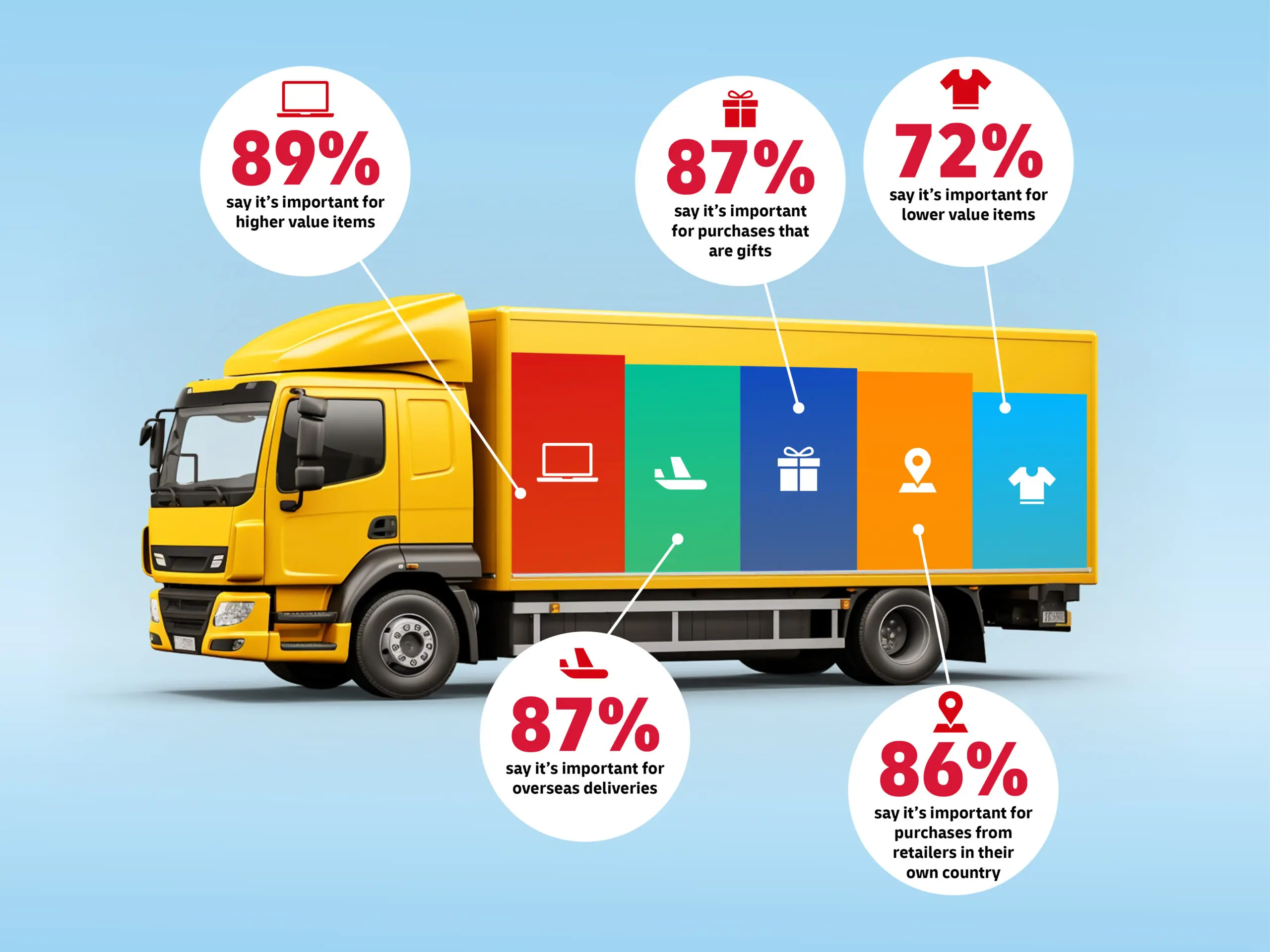
Giving the data meaning is exactly what helped our DHL eCommerce Trends Report win Best Visualisation of Data at the DataComms Awards. To bring insights to life, we created a series of visually engaging reports using real-world objects and relatable examples to illustrate key statistics. This made the data more relevant and easier to digest.
Bring your story to life with:
- Callout boxes for key insights and takeaways
- Real quotes or short case studies to humanise the numbers
- Icons or infographics to highlight trends and comparisons
Think about your audience from the start
Reports are more effective when they speak directly to their audience’s needs. So before you put pen to paper (or fingers to keyboard), ask yourself:
- What does your audience really want to know?
- What would make this report useful for them?
- How can these insights help them?
Build your report around what they need – not just what you have.
Be brave
It’s tempting to play it safe in reporting: present the facts, avoid interpretation, steer clear of conclusions. But in doing so, we miss the chance to lead. As communicators, our role is to highlight what matters – and help people do something with the information they’ve been given.
Don’t just present the data. Tell people what it means. That’s what turns a report into a decision-making tool, not just a data archive. Leading with insights doesn’t mean ignoring the data. It means shining a light on the meaning behind the data, so your audience can see clearly and act based on these insights.
Ready to create a report that gets noticed – and acted on? Explore our report design services to see how we can help you turn complex data into something insightful, accessible and award-winning. Or get in touch – we’d love to chat.