

How can charities unlock more value from their impact report?
By Sally Pritchett
CEO
Five practical ways to get more from your charity impact reporting - making the story more meaningful, encouraging action and extending its value beyond publication.
Charities put a huge amount of work into impact reports. There is data to gather, stories to find, stakeholders to consult and approvals to work through before you even get to shaping the story, developing the key messages, writing the content and designing the final report.
Then it gets published, shared for a few weeks and, all too often, left there.
That means much of the report’s potential can go unused. A strong impact report can help people understand the difference your charity makes, build confidence in your organisation and encourage supporters, funders and partners to engage further. It can also create a valuable bank of stories, evidence and creative assets that keeps working long after publication.
We explored this topic during the B Corp Agency Alliance Charity Support Sessions, a free virtual event bringing together specialist B Corp agencies to share practical support with charities and not-for-profits. As part of the morning, our Commercial Director Felicity Allen and Creative Nikki James shared five ways charities can unlock more value from their impact reports.
1. Focus on the difference you made, not just what you did
It is easy for an impact report to become just a record of activity. We launched this, we delivered that, we supported this many people, we raised this much money.
Those facts matter because they show the scale of the work and give readers evidence of what has happened. But they do not always answer the question people really care about: what difference did it all make?
One example Felicity and Nikki explored throughout the session was an impact report we created for Autism Unlimited.
Alongside the important headline figures, the report featured stories from service users, including Max, whose experience showed how Autism Unlimited had helped him build a more independent future. The figures showed the scale of the charity’s work. Max’s story showed the difference behind them.
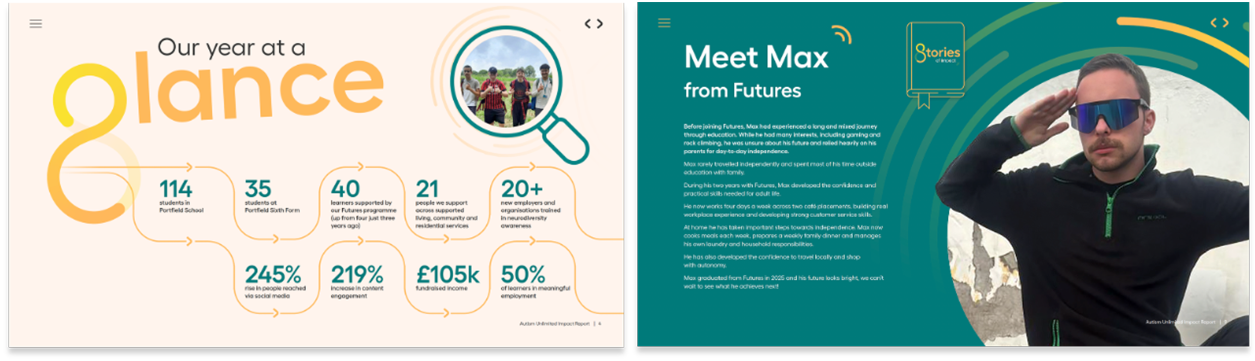
That is a useful balance to aim for throughout an impact report. Use the data to demonstrate reach and progress, then use people’s stories to show what those numbers mean in real life.
2. Use transparency to build trust
An impact report should absolutely celebrate what has gone well. That doesn’t mean every target needs to look like it was hit or every project needs to have gone exactly to plan. For charities asking donors, supporters, trustees and funders to place trust in the organisation, being open about where things didn’t go to plan and what you have learned from that can make the story more credible.
When we created our own impact report at Something Big, for example, we included a section focused on what we had learned during the year. We used a simple ‘We said, we did, we learnt’ approach, giving the learning the same prominence as the progress rather than hiding it in a footnote at the back.
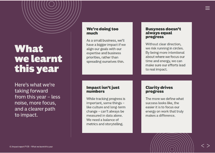
You might acknowledge where a target was missed, explain what changed along the way or show how an experience will influence what you do next. It gives readers a more rounded picture of progress and shows how the organisation is learning and responding.
3. Make the important things easy to understand
Impact reports need to communicate a lot, from financial information and programme updates to statistics, case studies and evidence of progress. Without a clear hierarchy, it can be difficult for readers to know what matters most. Good impact report design should guide readers towards the information you really want them to take away.
Most readers will skim rather than work through every page word for word, so the design needs to help them find the important parts quickly. In practice, that could be as simple as turning a dense table into a clear chart, pulling out one meaningful statistic rather than giving twelve equal weight or giving an important story more room on the page. Every design choice should make the information easier to understand.
Accessibility should be part of this thinking from the start too, helping make the report easier for everyone to understand and navigate.
4. Give people somewhere useful to go next
If a section of your report makes someone want to know more or get involved, what do you want them to do next?
The next step might be making a donation, finding out more about a service, becoming a volunteer, starting a partnership conversation or sharing your work with somebody else. Thinking about this early makes it easier to build natural next steps into the report.
You do not need to fill every page with buttons and donation prompts. The best calls to action make sense in the context of what someone has just read. If a story will make someone want to know more, give them a clear route to continue exploring it. If a section has shown what a particular programme achieved, that may be a natural moment to explain how people can support or get involved.
The aim is to avoid creating a dead end just as you have earned somebody’s attention.
5. Extend the impact beyond launch
By the time you have created an impact report, you have often created one of the richest banks of content your charity has. There are stories, quotes, statistics, photographs, evidence of change and examples of what funding has made possible. All of that can continue to work elsewhere.
A strong case study might become a story for your website, social content or part of a presentation to a potential funder. A useful statistic might strengthen an email to supporters, a funding presentation or future fundraising communications. Quotes and photography can continue to tell the story of your work throughout the year and beyond.
Think about reuse while you are creating the report, rather than once it is finished. A case study that could become a social carousel can be written and designed with that in mind. A useful statistic can be created so it works just as well in presentations or campaign content.
Your impact report can be the place where all of that evidence comes together. It does not need to be the only place it lives.
Make more of your impact report
A strong impact report can help people understand the difference behind the numbers, build confidence in your organisation and encourage supporters, funders and partners to take the next step. And once the report is published, the stories, evidence and assets you have created can keep supporting fundraising, stakeholder engagement and communications throughout the year.
If you are working on your next charity impact report, we can support you wherever you are in the process.
Already have a report and want to know how it could work harder? Report Reviewer gives you an expert review across storytelling, structure, accessibility and design, plus practical recommendations, with prices starting from £495 + VAT
Have your content and story ready, but need help bringing it together? Report Producer gives you expert design and production support to turn it into a polished, accessible report.
If you have the evidence, progress and data but need help finding the story, shaping the structure and writing the content, Report Builder supports you through the whole process.
And if you want your report to keep creating value for your charity, Report Launcher turns it into a ready-to-go campaign, giving you the messages, creative assets and content you need to share the story across the channels and audiences that matter to your charity.
How to Make Your Charity Impact Report More Effective | 5 Practical Tips


Five ways to make your report more accessible
By Sally Pritchett
CEO
Writing a great report is one thing. Making sure it’s accessible for your readers is another.
Accessibility goes beyond font size or colour contrast – it’s also about creating content that people can understand and engage with. And that starts with how we write, structure and design our reports.
Whether you’re creating an impact report, gender pay gap report, annual report, ESG report or something else, here are five practical ways to make your report more accessible and digestible.
Keep language simple
Complex language, overly long sentences, unfamiliar words all make writing more inaccessible. Using simpler language and keeping sentences clear and concise can make it easier for your audience to stay engaged as they read.
- Swap complex or long words for simpler alternatives (e.g. use ‘help’ instead of ‘assist’)
- Break up long sentences, and write the way you speak
Top tip: Read your content out loud. If it sounds unnatural or clunky, rework it until it flows in a similar way to how you’d speak.
If you’re looking for more ways to write in a clear, inclusive way – not just in reports but across all your channels – our guide to creating authentic, accessible and inclusive communications is a good place to start.
Don’t assume knowledge
Acronyms, industry terms and technical jargon can quickly alienate readers unfamiliar with the topic. If you must include them, always explain the term the first time you use it.
Writing in a way that assumes no prior knowledge isn’t patronising – it’s inclusive. It means anyone, whether they’re new to the subject or an expert, can follow your report without confusion.
Structure matters – break content down
No one wants to read pages of big blocks of text. Well-structured content is easier to scan, understand and remember. Think about what you’re trying to say – and how you can say it in fewer words or in an easier-to-digest way.
- Use clear headings and subheadings to break up text
- Make information easier to scan with bullet points and numbered lists
- Make key messages easy to find in the flow of the content, using callouts or visual elements to support them where useful
Use inclusive visuals
Not everyone processes information the same way. Visual elements like infographics, diagrams and charts can help bring your content to life. However, it’s important to ensure any visuals you use are accessible.
- Choose high-contrast colours and legible fonts
- Avoid using colour alone to differentiate data – also use patterns, labels, symbols or shapes for each section of a chart or graph
- Add meaningful alt text to all informative images for screen reader users
- Avoid overuse of decorative visuals that distract from your message, and mark them as decorative rather than describing unnecessarily
Top tip: Consider whether the message would still be clear if the image didn’t load.
Make it keyboard and screen reader friendly
If your report is digital, it should be easy to navigate with a keyboard and work properly with screen readers.
- Use proper heading styles (H1, H2, etc.) rather than relying on visual formatting alone
- Make sure PDFs are properly tagged and follow a logical reading order
- Keep important information as real text rather than embedding it in images or scanned pages
- Use descriptive links, such as ‘Download the 2026 Report’ instead of ‘Click here’
- Keep tables simple and make sure headings and data are structured properly
Where possible, it can also be worth providing an HTML version alongside a PDF, particularly if the report is being published online for a wide audience.
Top tip: Use built-in accessibility checkers, such as those in Microsoft Word or Adobe Acrobat, as a starting point. If possible, ask real users to test your report and provide feedback.
A report that’s easy to navigate and understand gives more people the chance to engage with what you’re sharing. Thinking about accessibility from the start can make it easier for readers to find the information they need and use it.
Want to make your next report stronger?
If you already have a report and want to understand where it could be improved, our Report Reviewer gives you an expert review of its storytelling, structure, accessibility and design.
If you’re starting from data, evidence or source material and need support turning it into a finished report, our Report Builder can support the process from structure and content through to design and production.
Or, if you’d like to talk through what you need, get in touch.
FAQs about accessible report design
An accessible report is easy for people to read, navigate and understand. That means using clear language, logical structure, legible design, accessible colour contrast, descriptive links, meaningful alt text and formatting that works for screen readers and keyboard navigation.
Accessibility matters because reports are often created to inform, influence or build trust with important audiences. If a report is difficult to read, navigate or understand, people are less likely to engage with the content, remember the key messages or act on the insight.
Your report may need improving if it feels too long, hard to navigate, overly technical, visually cluttered or difficult to use as a digital document. It may also need a review if the content is strong, but the story, structure, accessibility or design are making it harder for audiences to engage with.
Our Report Reviewer product is designed for organisations with an existing report that is live, in draft or ready to refresh. We review your report across storytelling, structure, accessibility and design, then provide practical recommendations to make it more engaging, easier to navigate and more useful for your audience.
Something Big can support with different stages of report creation, from reviewing what you already have to designing, producing and launching a new report. Depending on what you need, we can help improve an existing draft, turn agreed content and data into a polished report, build the story and structure from the start, or create campaign assets that help your insight reach the right audiences. And if you have a report brief ready to go, then use our report briefing tool to get started.

How leading with insights turns data into award-winning reports
By Sally Pritchett
CEO
Following our recent Best Visualisation of Data award win at the DataComms Awards, we’re sharing how to bring data to life in your reports – so it’s not just seen, but understood.
When it comes to writing a report, the first instinct is often to include as much data as possible. But more data doesn’t always mean better communication – not because people don’t care about the data, but because the data isn’t doing enough to care about them.
In today’s digital-first world, where we’re constantly bombarded with information, reports need to do more than simply inform. It’s time to move away from overwhelming data dumps and start leading with insights that drive decisions, inspire action and deliver real value.
Here are some top tips to help you lead with insights in your next report:
Start with the ‘so what?’
You’ve got the data, and you may have even turned it into charts and visuals. Now it’s time to ask yourself, what does it mean? What should your audience take away? That’s where insight comes in.
An insight goes beyond the numbers. It connects the dots, explains why something matters and puts it into context for your reader – for their business, their industry and their priorities.
For example, instead of writing ‘Employee engagement scores dropped 4% this year’, try
‘A 4% drop in engagement suggests teams may be feeling disconnected – highlighting the need for increased leadership visibility.’
Don’t hide the insights
Not everyone reads a report cover to cover. They might skim read, search for the information most relevant to them or just scan the headlines and visuals.
Make sure your insights are easy to find and hard to miss:
- Include a short, punchy introduction or summary that pulls out key insights.
- Start each section of the report with a headline insight and end each section with a summary of key takeaways, actions or recommendations.
- Keep the detailed data to appendices so it’s there if needed but not blocking the story upfront.
Show the story, not just the stats
Even the clearest charts, graphs and visuals can fall flat if they’re not framed with meaning. Data alone rarely changes minds. But data backed by context and meaning? That can have an impact.
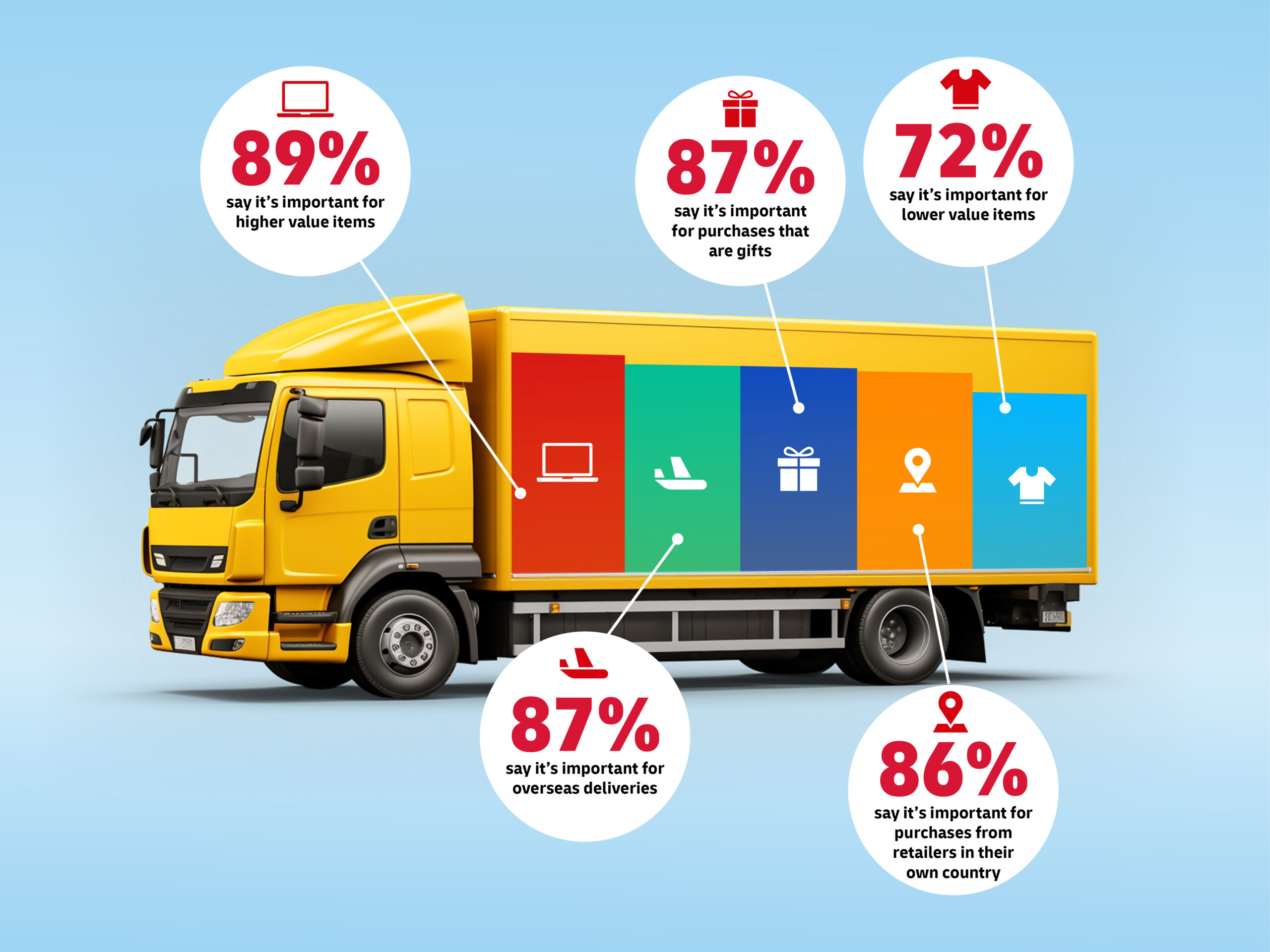
Giving the data meaning is exactly what helped our DHL eCommerce Trends Report win Best Visualisation of Data at the DataComms Awards. To bring insights to life, we created a series of visually engaging reports using real-world objects and relatable examples to illustrate key statistics. This made the data more relevant and easier to digest.
Bring your story to life with:
- Callout boxes for key insights and takeaways
- Real quotes or short case studies to humanise the numbers
- Icons or infographics to highlight trends and comparisons
Think about your audience from the start
Reports are more effective when they speak directly to their audience’s needs. So before you put pen to paper (or fingers to keyboard), ask yourself:
- What does your audience really want to know?
- What would make this report useful for them?
- How can these insights help them?
Build your report around what they need – not just what you have.
Be brave
It’s tempting to play it safe in reporting: present the facts, avoid interpretation, steer clear of conclusions. But in doing so, we miss the chance to lead. As communicators, our role is to highlight what matters – and help people do something with the information they’ve been given.
Don’t just present the data. Tell people what it means. That’s what turns a report into a decision-making tool, not just a data archive. Leading with insights doesn’t mean ignoring the data. It means shining a light on the meaning behind the data, so your audience can see clearly and act based on these insights.
Ready to create a report that gets noticed – and acted on? Explore our report design services to see how we can help you turn complex data into something insightful, accessible and award-winning. Or get in touch – we’d love to chat.